

Client: Huxley Medical App
Duration: 4 Weeks
Tools: Figma , Adobe Photoshop, Maze, Adobe Illustrator
Responsibilities: User research, UX & UI design, Prototyping, User Testing
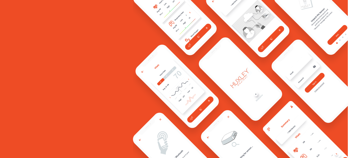
Design a mobile app for Huxley’s sleep patch capable of inputting patient info and medical history, providing device instructions, device status, and vitals status.
People who have been prescribed a home sleep test by their physician. Potential users can be from various age, sex, and race demographics, and with different levels of familiarity with smart phones and mobile applications.
Huxley Medical Inc. is developing a unique wearable diagnostic device for patients with sleep apnea. While many companies offer wearable technologies, there is no other similar product in the market. Given that the targeted user population includes seniors, the app needs to be very user friendly while providing range of clinical grade information.
A key challenge is to ensure that accurate and actionable clinical information regarding patient's health status is presented to user in an easy-to-understand format for a wide range of users.
Huxley Medical, Inc. develops and markets devices and algorithms that increase access to multiple disease diagnostics and treatments. One of the main components of Huxley’s development plan is creating a patient app that provides the users with the ability to interact with their device, provider, and customer support.

Wearable devices industry has experienced a rapid growth in the last few years. In particular, mobile apps designed for consumer-grade health tracking products such as smart watches provide the opportunity to understand the best practices when interacting with users.
Interviewing potential wearable device users is a great initial step s to understand their needs and pains During screening process, I realized that it is extremely challenging to identify users who have used clinical app rather than consumer products.
+ Sufficient information about the device's purpose and function is initially provided.
+ Clear and concise instructions are provided at each step of the device setup.
+ Instructions are available to the user at any time.
+ Dynamic illustrations are utilized to provide clear instructions.
+ The application shows a confirmation when a process is completed by user.
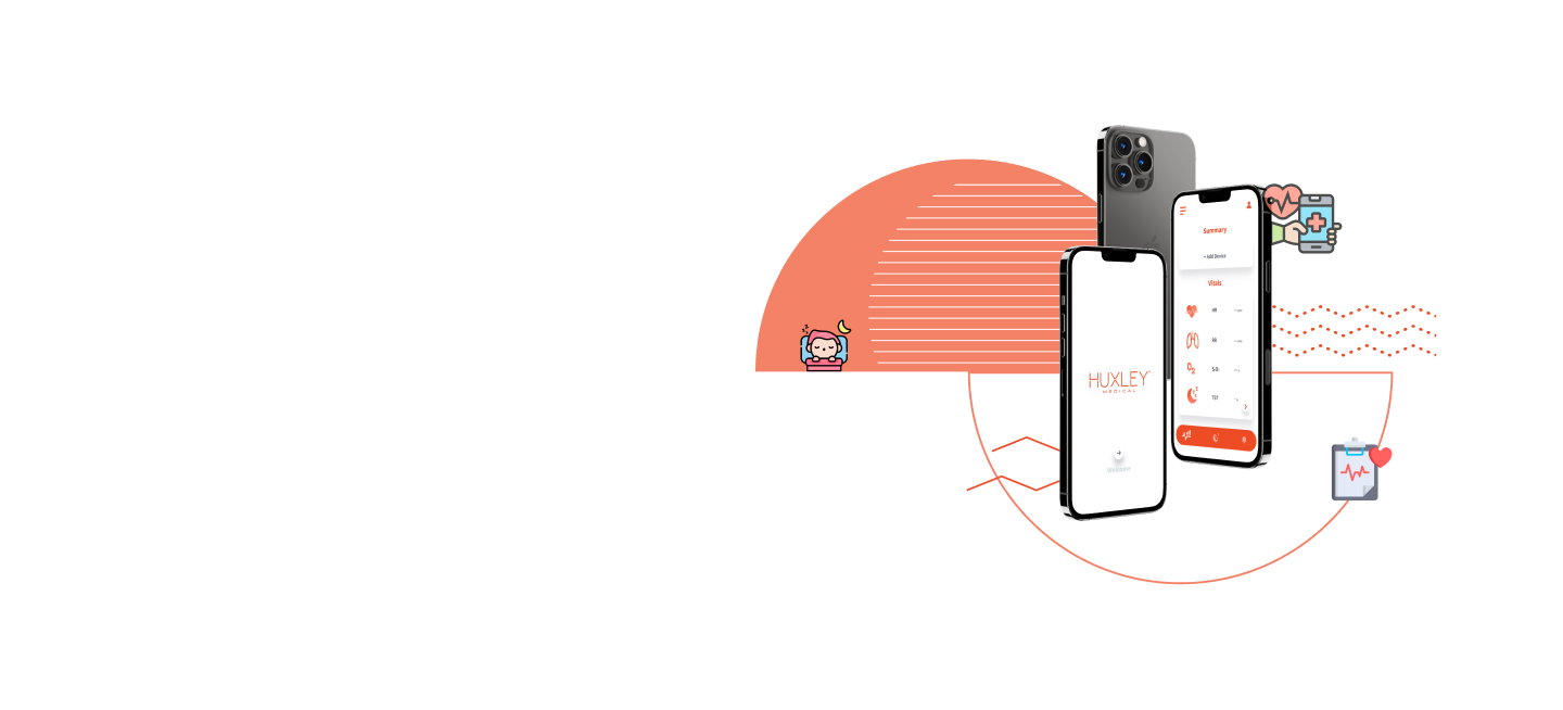
+ Use of visual graphs to provide users with a quick view of their health vitals.
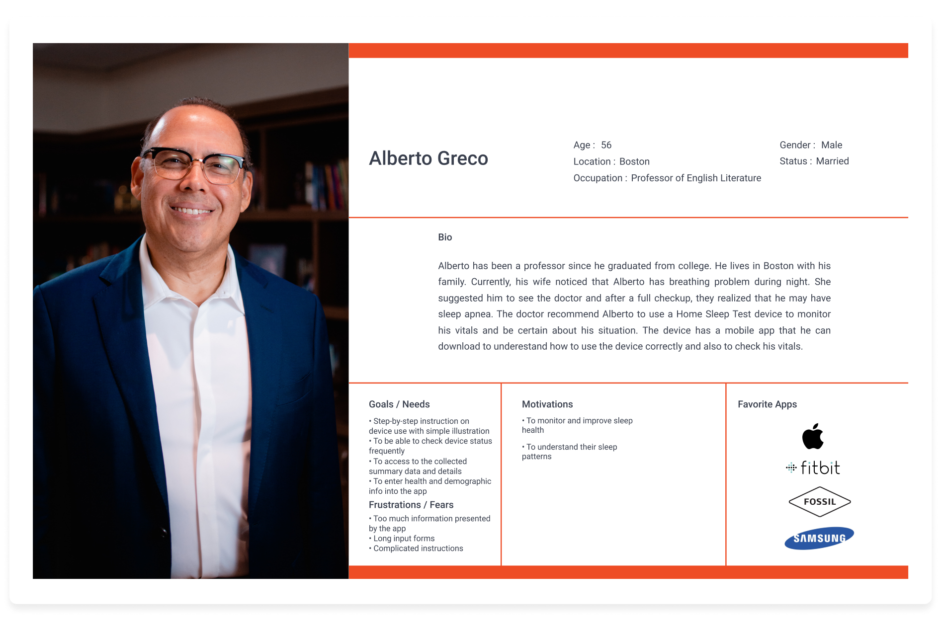
Alberto's Needs:
- A step-by-step instructions for device pairing and use
- Use of illustrations to facilitate the necessary training
- Easy access to summary and details of collection data
- An intuitive form to enter medical history and demographics
Alberto's Frustrations:
- Long input information forms
- Too much unnecessary information
- Complicated and hard-to-follow instructions

Based On
- Persona's needs
- Competitor analysis
- Overall research findings
- Client's requirements
Mapped Features
- MUST-HAVE
- NICE-TO-HAVE
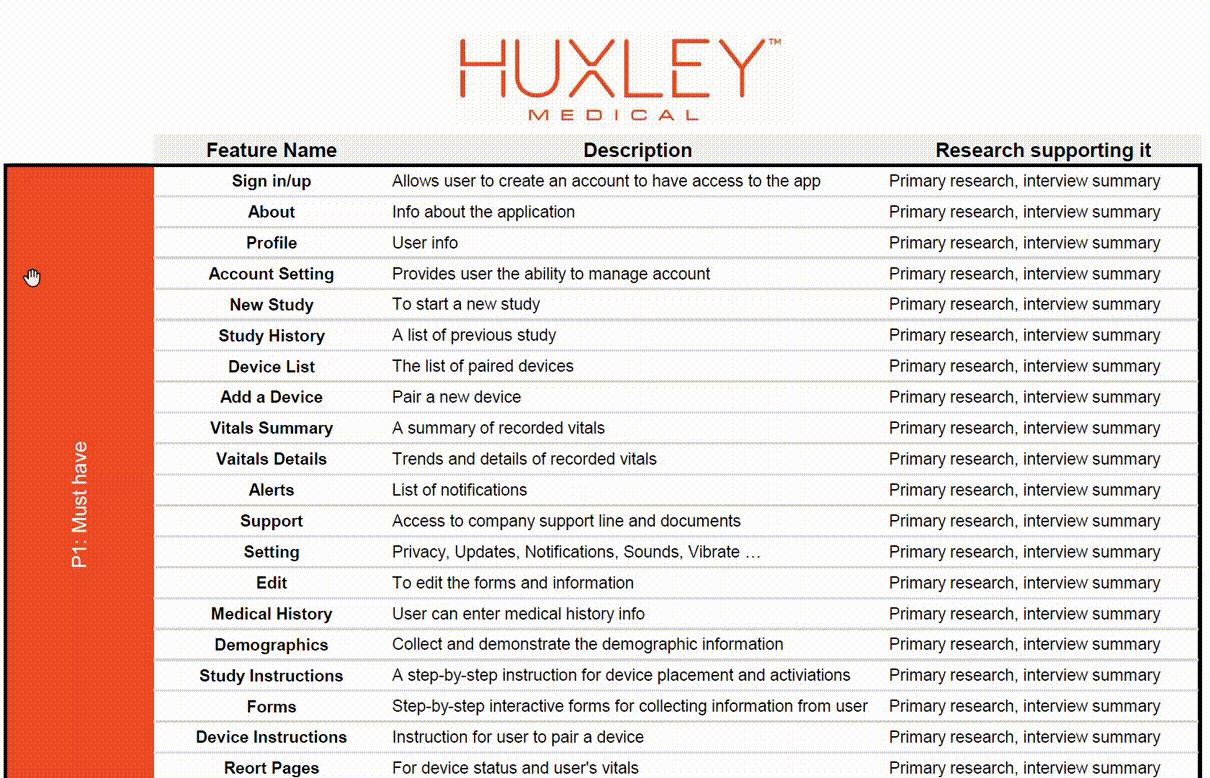
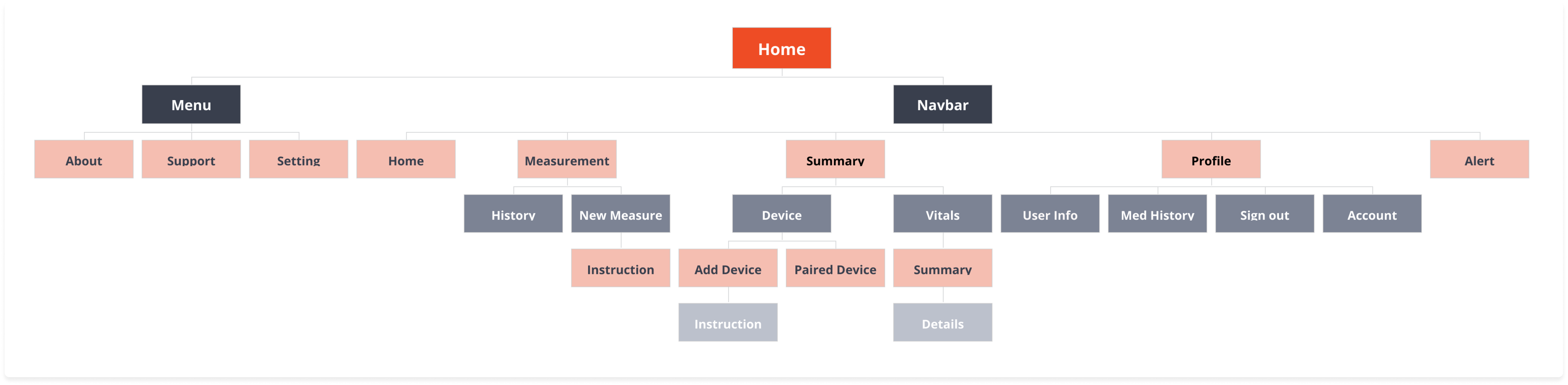
Further brainstorming with the client on the features listed in the road map, we were able to agree on the overall structure of application. After a few iterations, I organized the features and information into an application map. Being able to freeze the information architecture enabled me to start ideating on designs that can incorporate the features structure and hierarchy.
Main Categories:
- Measurements
- Summary
- Profile
- Alert
How can user complete a task?
What are the minimum required steps?
What are the possible actions user may take?
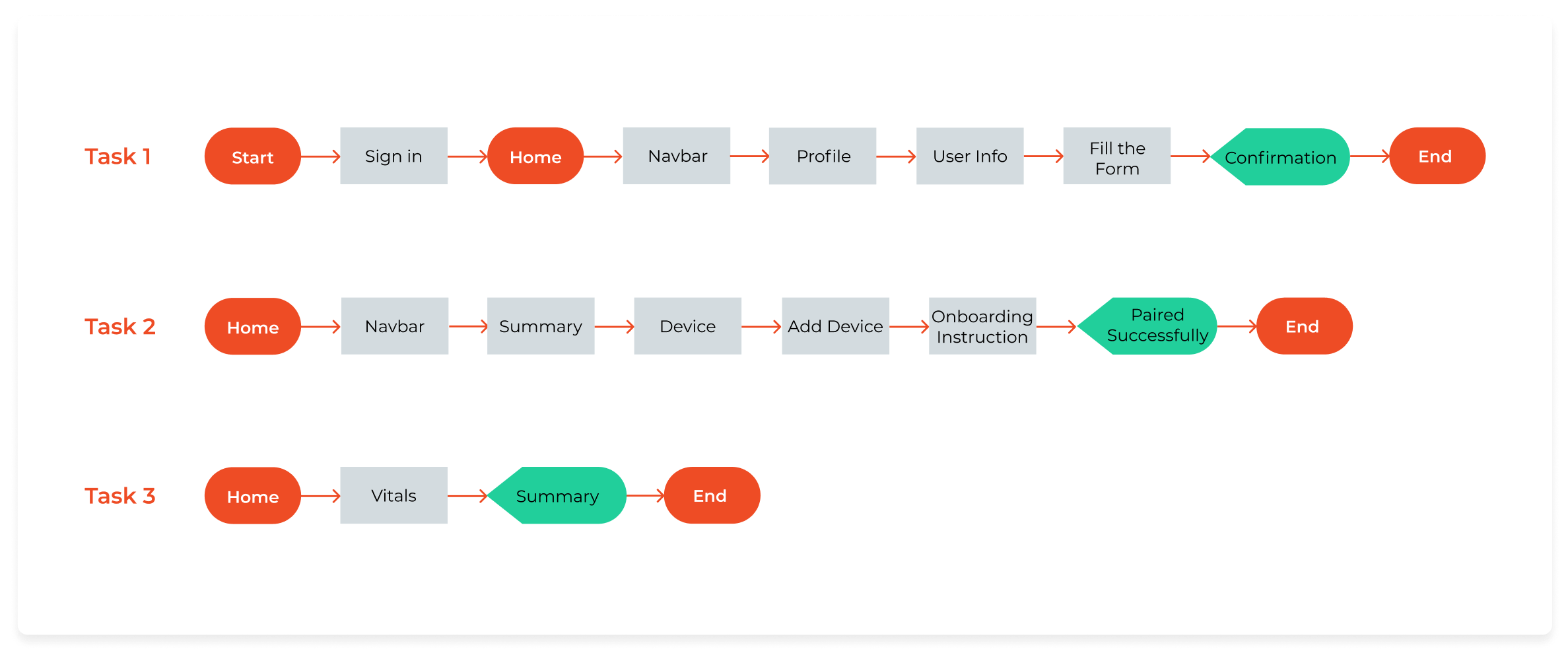

Combining the information structure summarized in the application map and specific task flows, I started creating design ideas to:
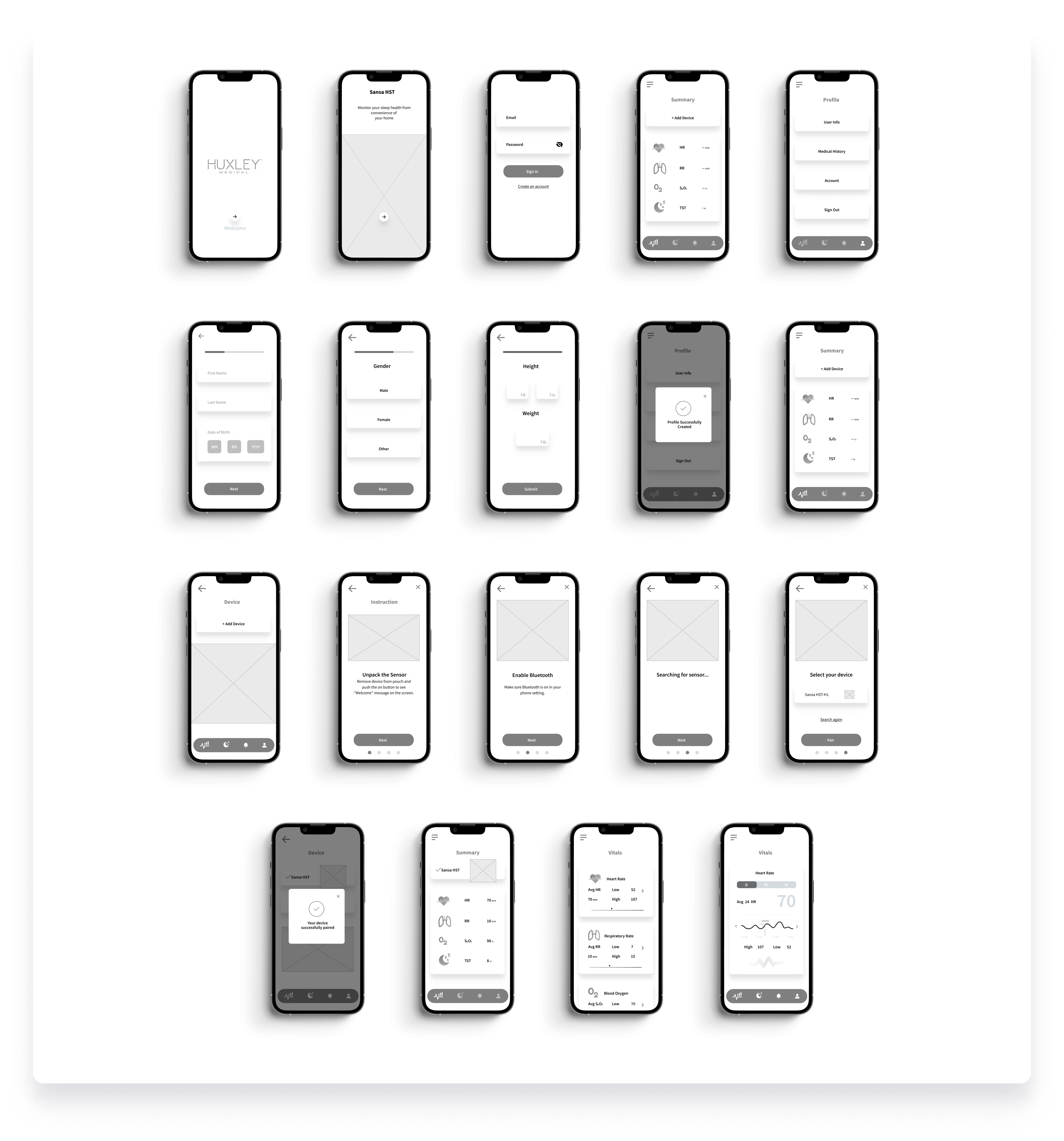

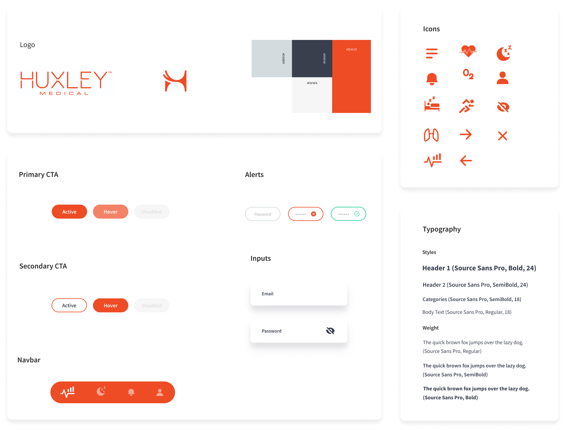
Based on the brand logo of the company, I created the UI kit to have a roadmap for the interface elements of the app. Creating a UI kit is an important part of my process and helps me communicate effectively with developers. Thus, it was important for me to revisit the UI kit while creating high-fidelity designs of the app to ensure all user interface elements are captured.

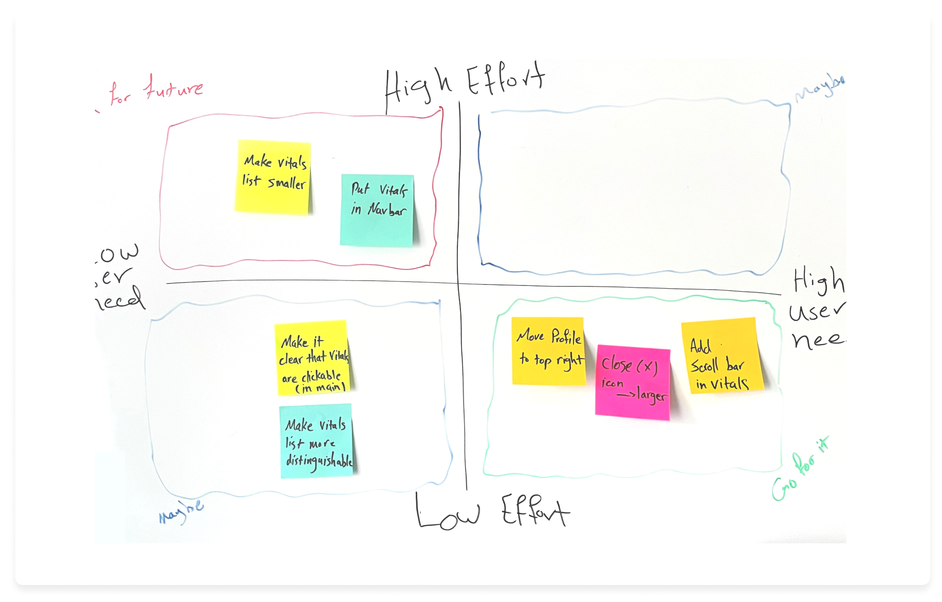
One last step before creating the high fidelity pages and prototype was to put the wireframes into user testing. Next to the research, testing has been always the most important part of my UX design as allows the potential users examine the design and provide feedback to every single part of the work. I decided to conduct the tests on the wireframes to focus on functionality of the added features. Results summarized in a decision matrix guided me through iterations and final design.
To Do:
- Move profile icon to top right
- Add a scroll bar to vitals
- Make (X) larger
Nice to Revise:
- Make vitals clickable
- Adjust vital list sizes
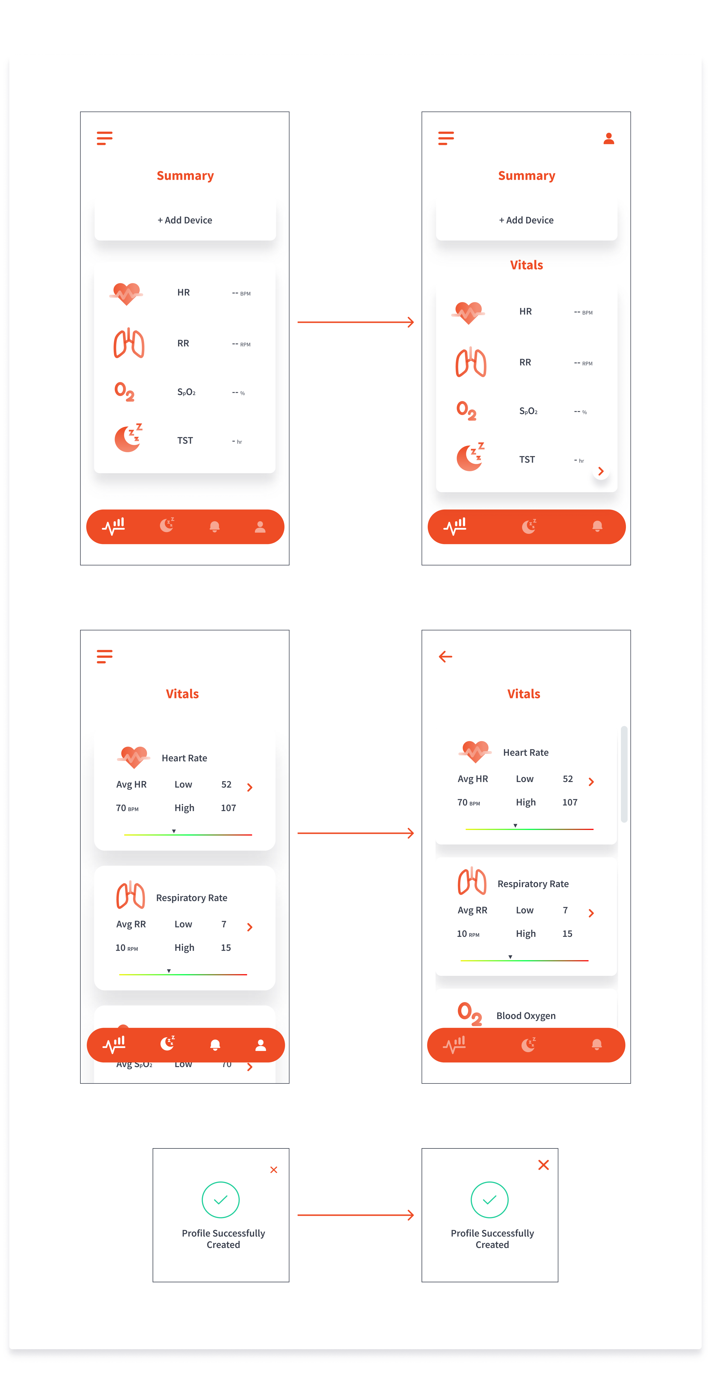
+ Moved the profile icon to the top right
+ Added the Vitals title to be more recognizable
+ Added clickable arrow to make this section more like clickable feature
+ Added the scroll bar
+ Decreased the space between the sections to make it more clear the page is scrollable
+ Made the close(X) larger

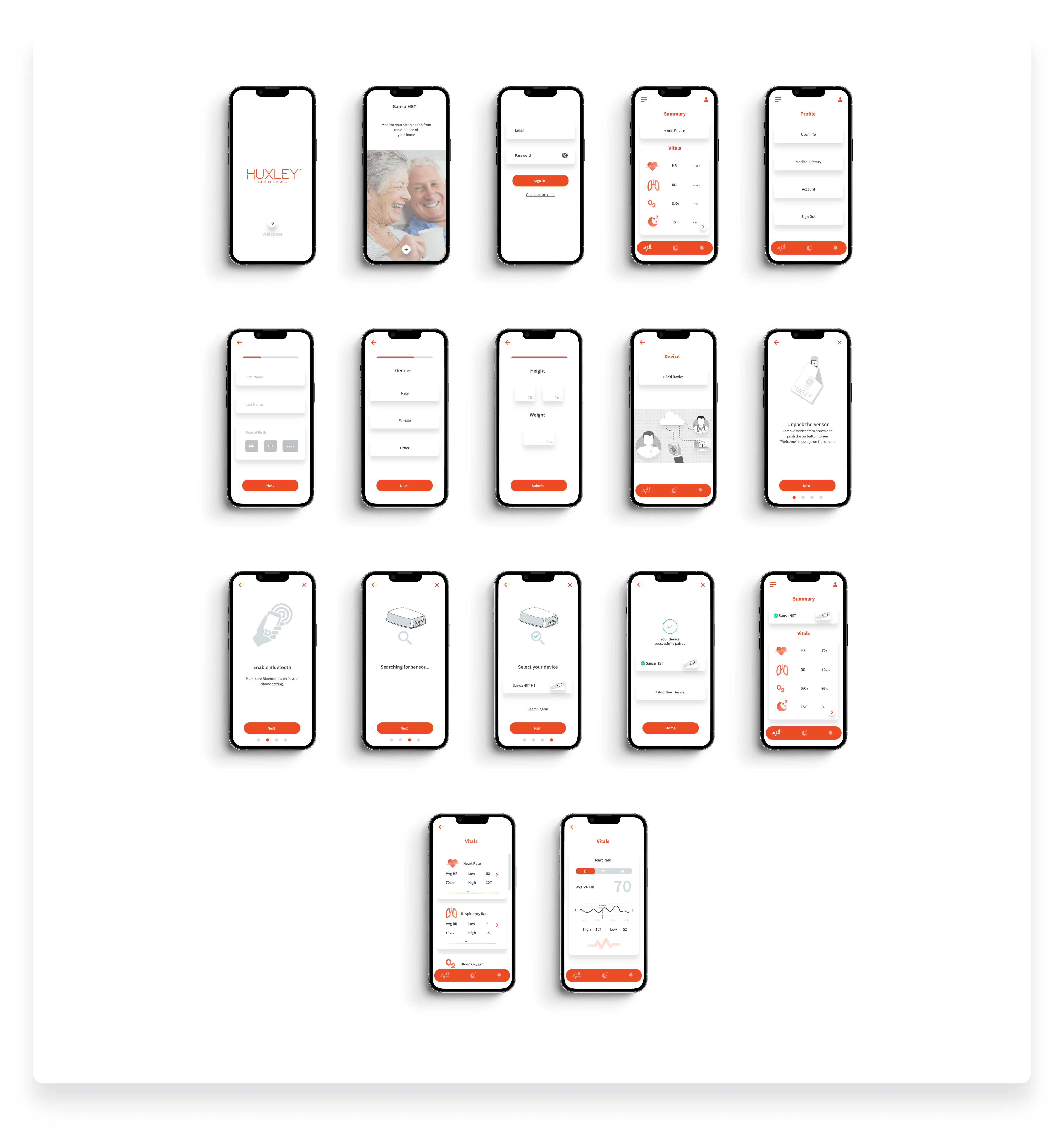
The designed pilot app was delivered to the client successfully. As the company continues to grow, I look forward to building more functionalities to support users.
Working on a brand-new mobile app for a startup company with lots of novel ideas, was a challenging yet joyful experience for me as a UX Designer.
anahita.azari@gmail.com
