

Client: Biovital Medical Inc.
Duration: 4 Weeks
Tools: Figma , Adobe Photoshop, Maze, Adobe Illustrator
Responsibilities: User research, UX & UI design, Prototyping, User Testing
People with cardiac complications who need to monitor their vitals regularly, cardiologists and cardiovascular care providers, and professional athletes.
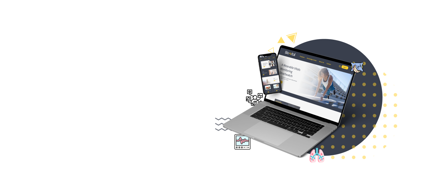
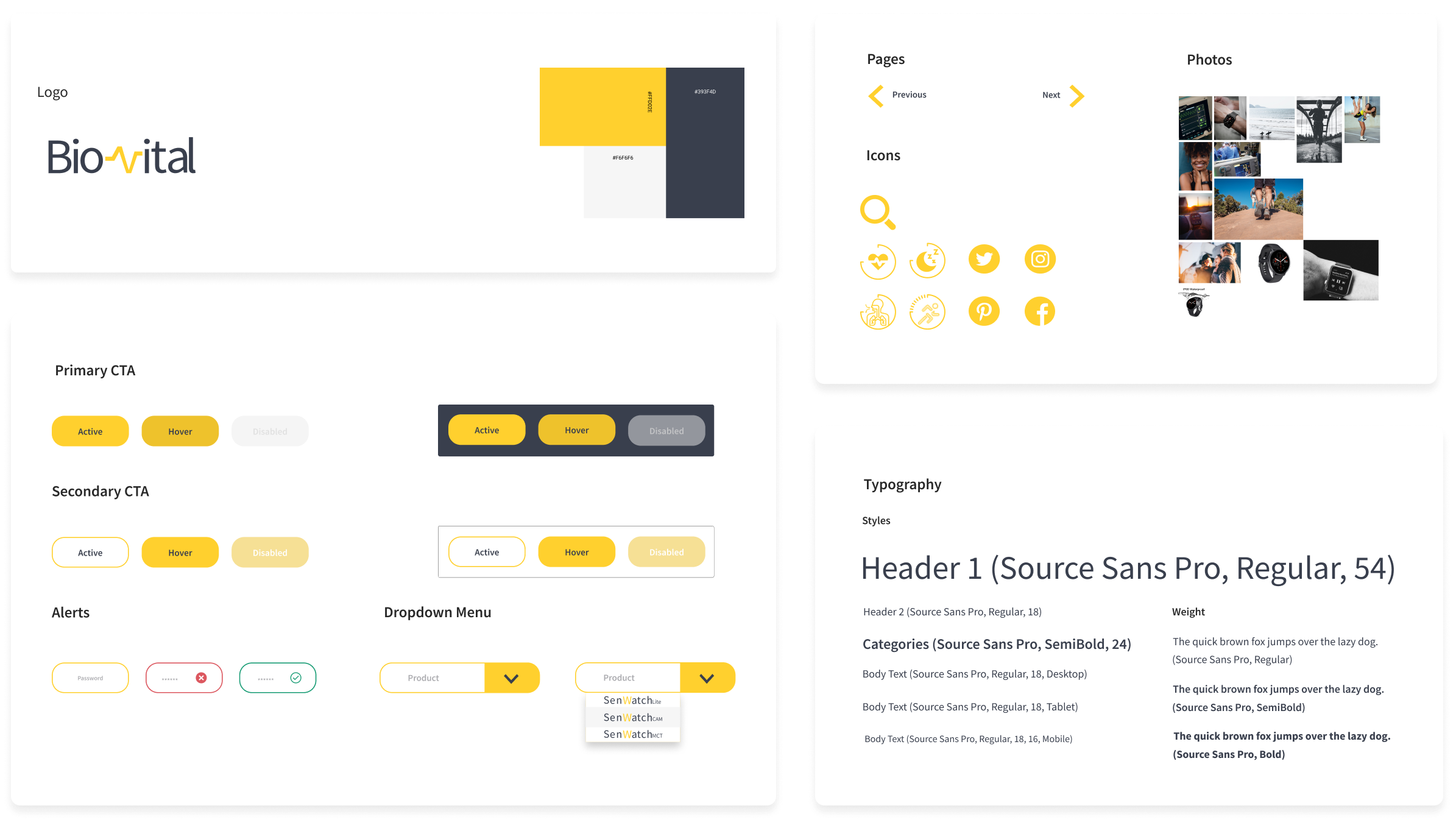
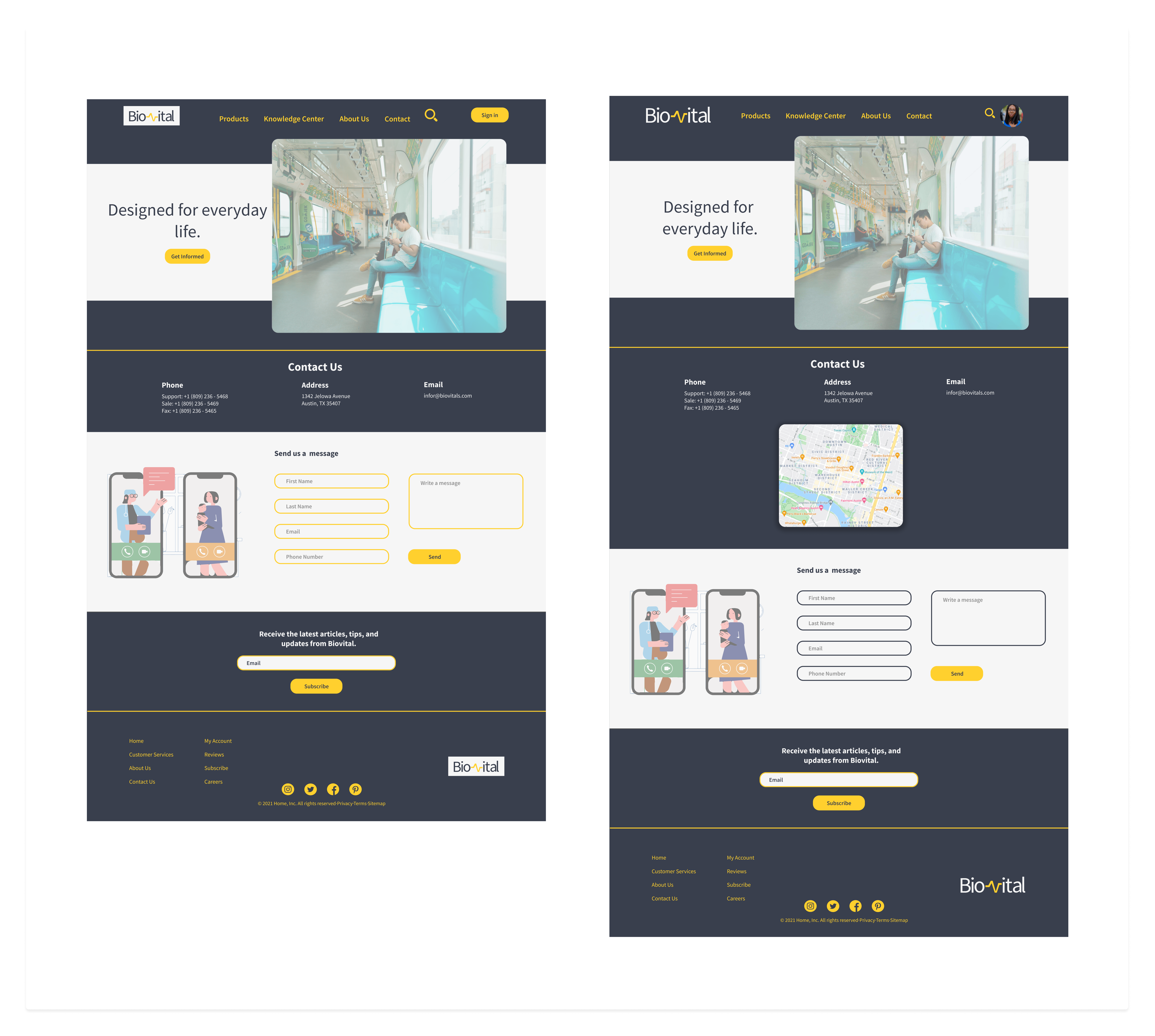
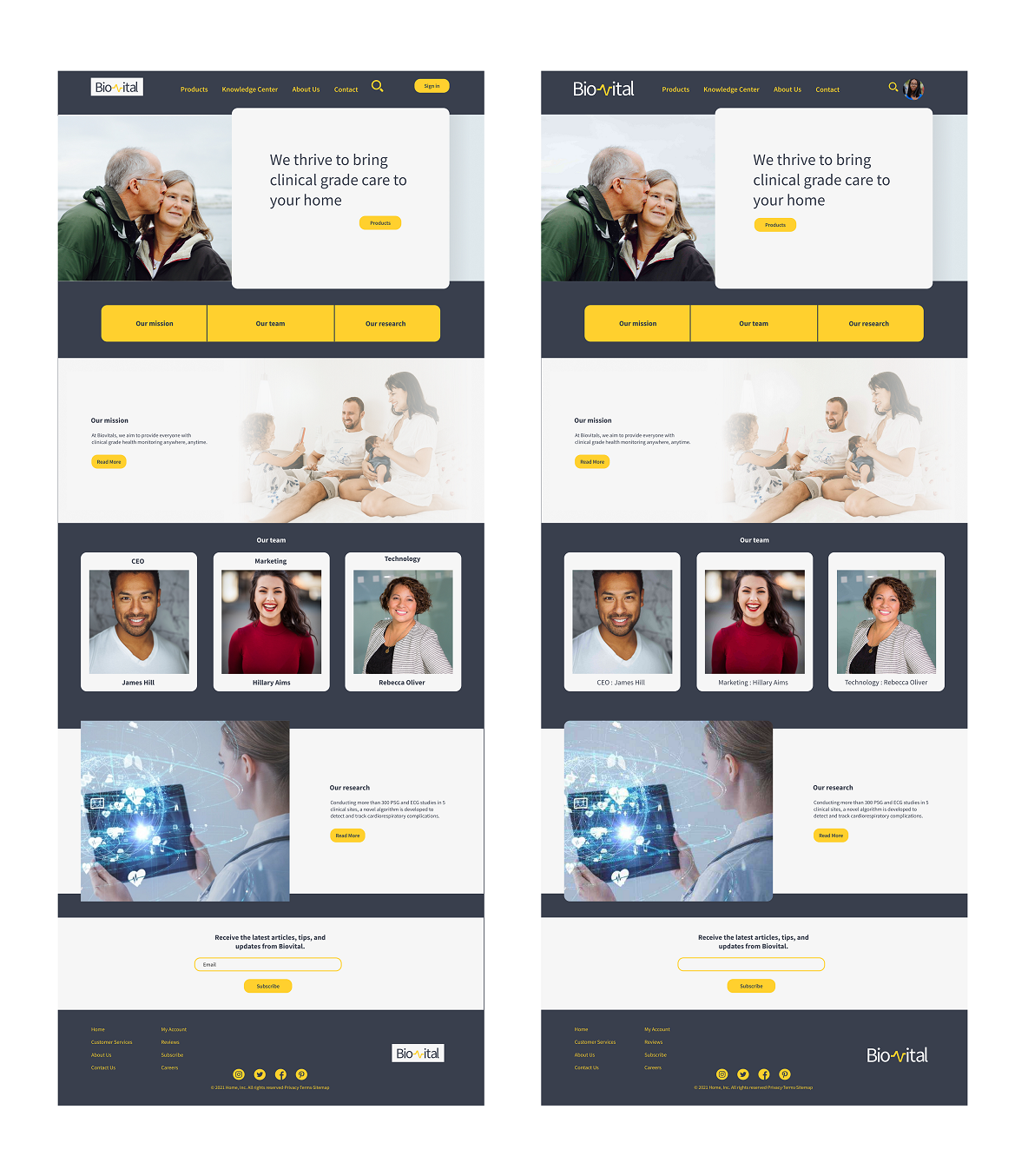
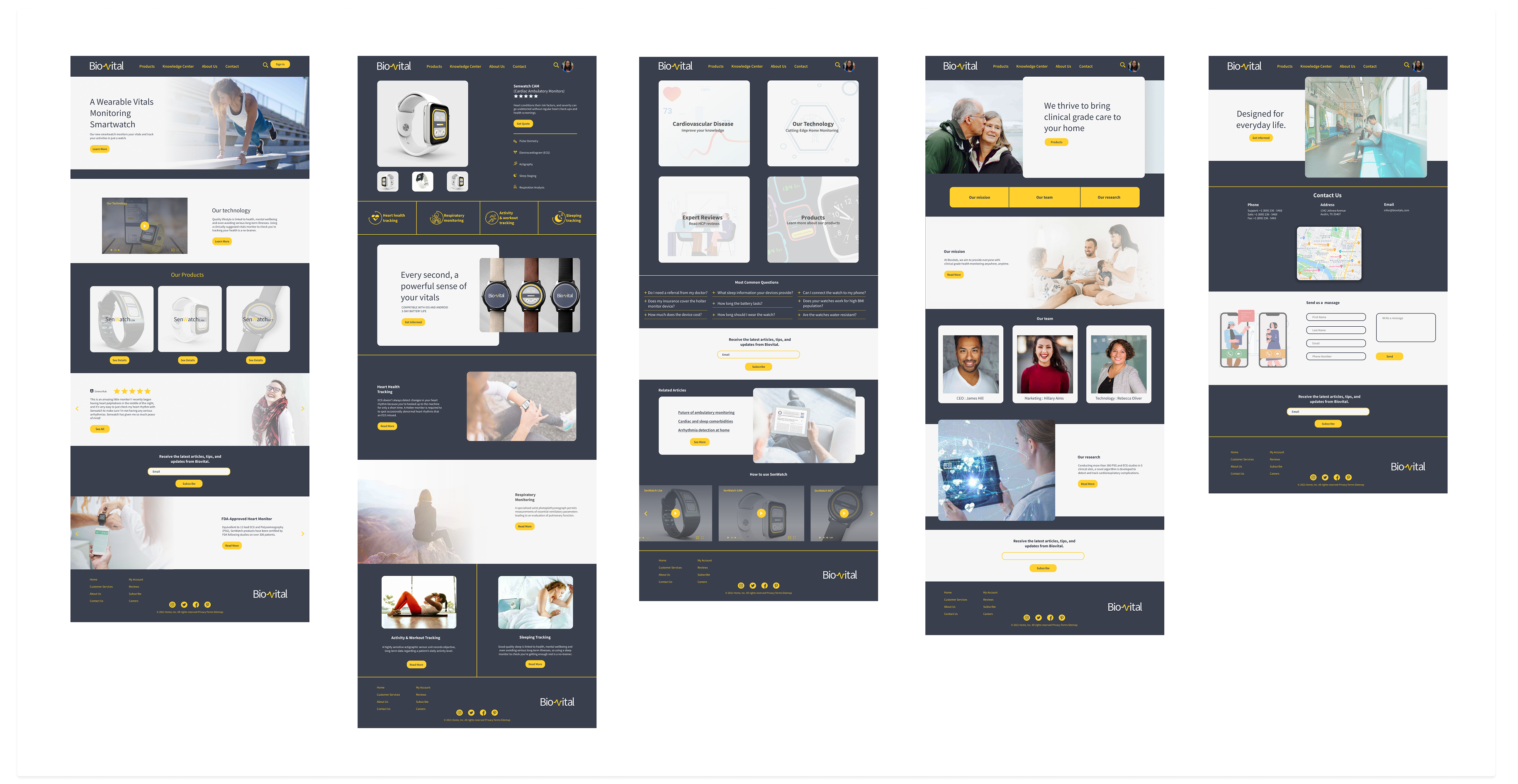
The main goal of Biovital website was to introduce a set of new wearable devices to the market for the first time. Being a new brand in the market, Biovital needed a responsive website that provides customers (patients and health care providers) with the information and instructions they needed. They also needed a set of logos to establish their brand.
It was very important to ensure technical and scientific information are presented in an aesthetic format that can target a large population of professionals and patients. A high-level introduction to SenWatch devices and their function for general users, and more detailed information for health care professionals needed to be provided on the same website. While an online store was not planned, the website needs to encourage the visitors to contact customer service or request a quote conveniently.
Biovital is a biomedical startup that tries to introduce its FDA-Approved product to a specific group of users. The main products are wearable watches capable of collecting physiological signals to inform clinicians about the cardiopulmonary conditions of patients. All products are branded under SenWatch and three versions of the device are available; Lite (primary), CAM (cardiac ambulatory monitoring), and MCT (mobile cardiac telemetry).

Since BioVital was a completely brand new company, I found it useful to analyze the websites of the competitors as a first step to understand the level of information and features usually provided to users.
The initial research was followed by interviewing potential users who are familiar with cardiac disease and monitoring devices. Initial screener questions were prepared to select the potential users from a poll of participants.
Due to the COVID-19 situation, it was a bit challenging to plan for in-person interviews and I had to schedule virtual meetings. However, preparing an interview script helped to guide the discussion and I found the results very helpful:
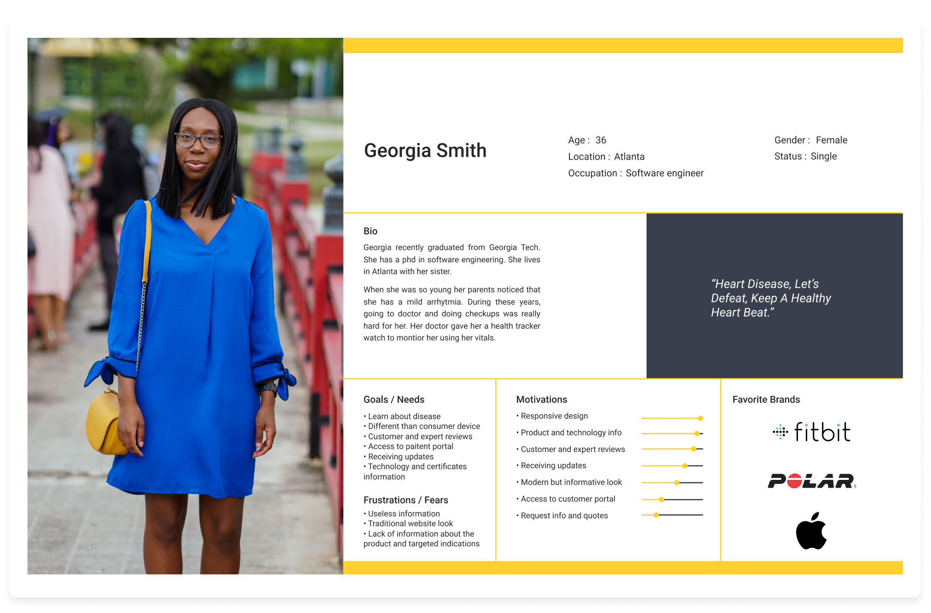
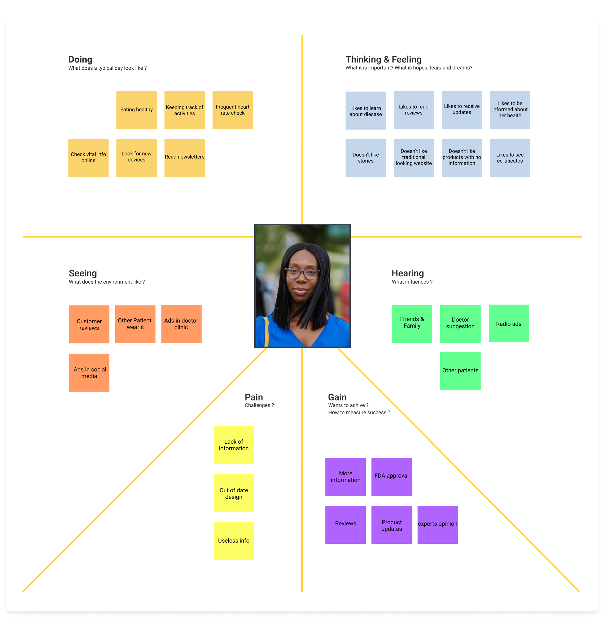
Based on my gatherings from the interviews and competitive analysis, I organized the information by creating a persona . Having a persona as a potential user and understanding the expectations, concerns, and motivations of targeted users, making it easier to think through a design that satisfies a wide range of users with different needs and fears.
To Provide sufficient information about:
- Products
- Disease
- Technologies
To avoid
- Outdated website look
-Irrelevant information
Next, I created the empathy map to have a deeper understanding of the user and summarized key insights from research in one visual reference.
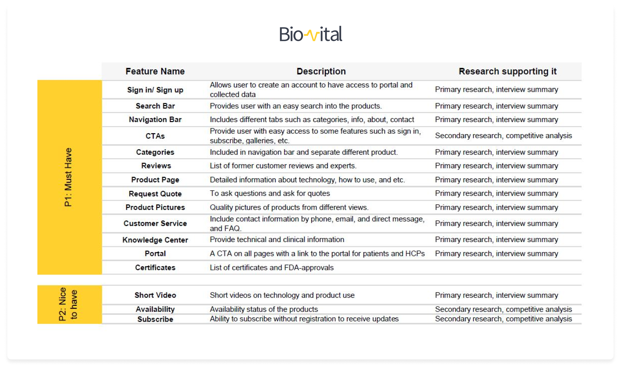
While the research direct outcomes were very valuable qualitative data, I quantified those by creating a road map that categorizes the features I wanted to include in my design into “must-have”, “nice to have”, and “optional”. Structuring the roadmap facilitated the creation of sitemap and preliminary ideation sketches of different pages to a large extent.
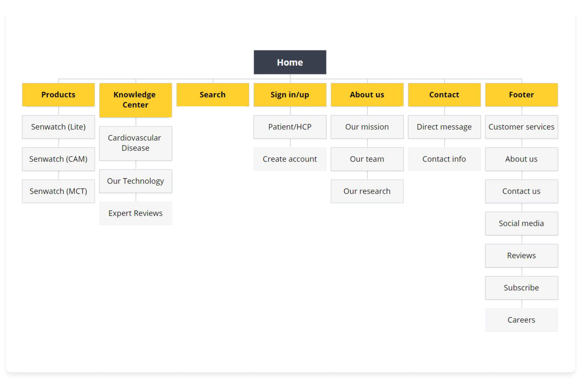
The sitemap helped me to see the connections and a clear visual hierarchy of the website in simplest way. Based on the personas needs and considering the roadmap, I structured the main categories and then subcategories.
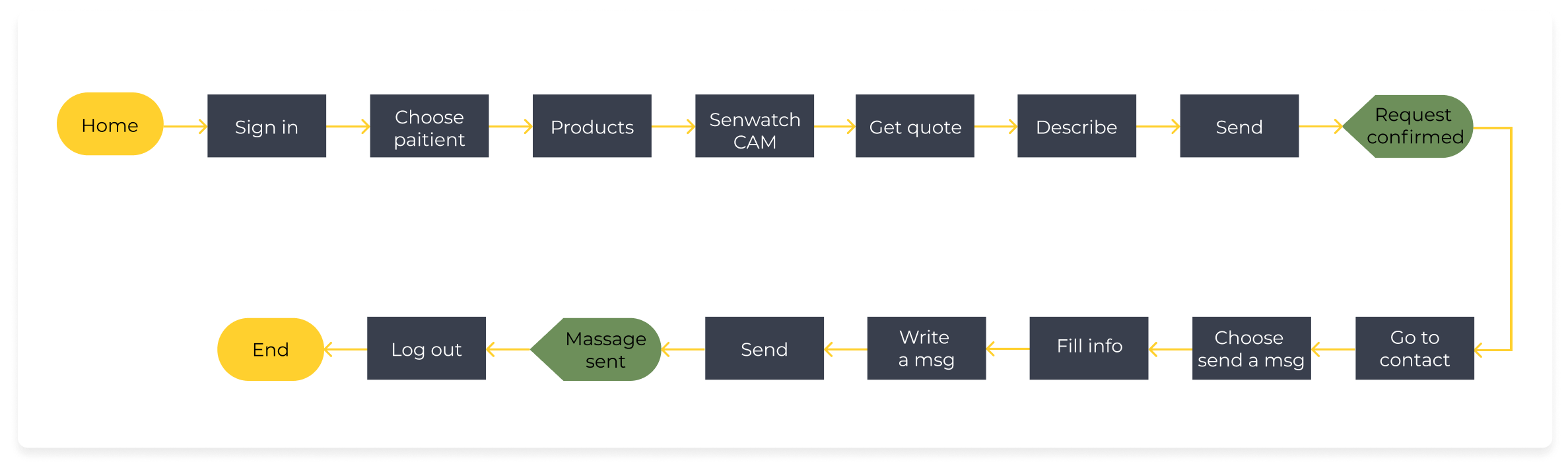
I considered different task flows and thought about an optimum and clear way of accomplishing those.
The flow allowed me to realize how a user could interact with the interface in order to
- Get a quote from selected product
- Contact with professional care through the website

Ideation and Wireframes
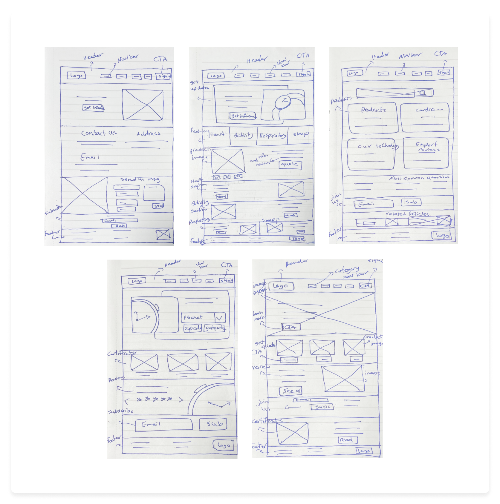
The thinking process led to the creation of initial wireframes that provide the minimum functionalities required by the user flow.
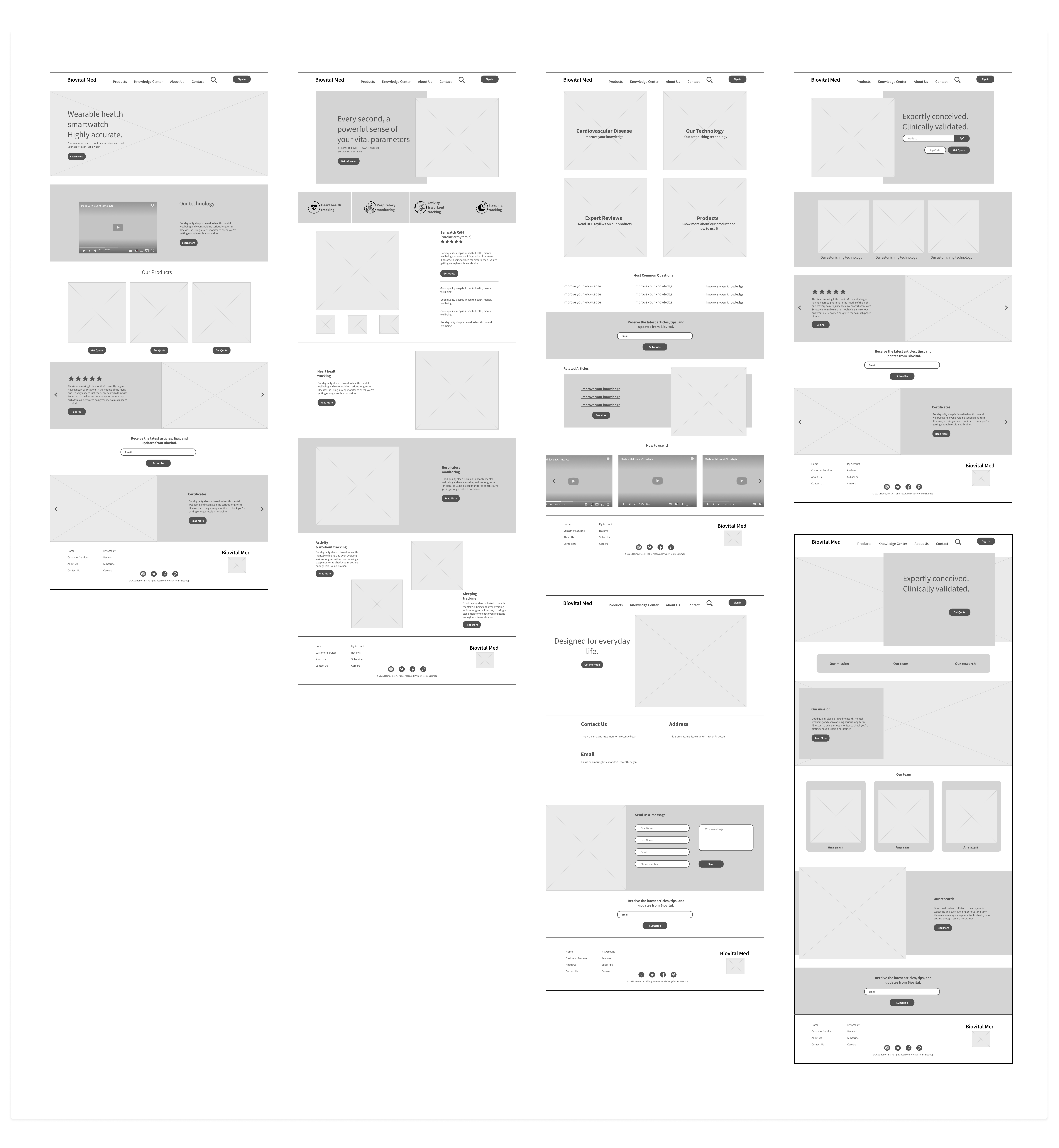

Having the structure of the website and functionality of different parts and features defined, I started to think about the aesthetic aspects and visual components in a multi-step design process:
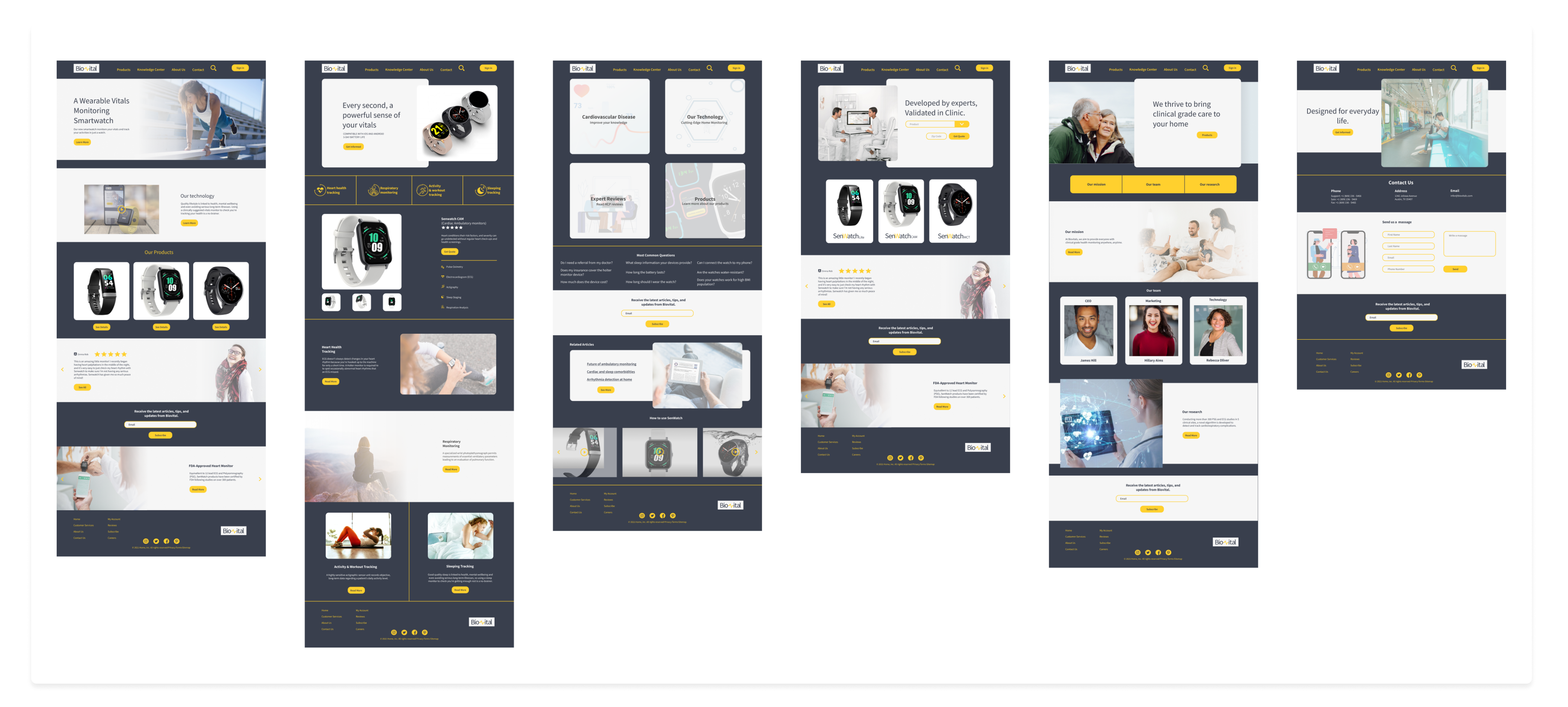
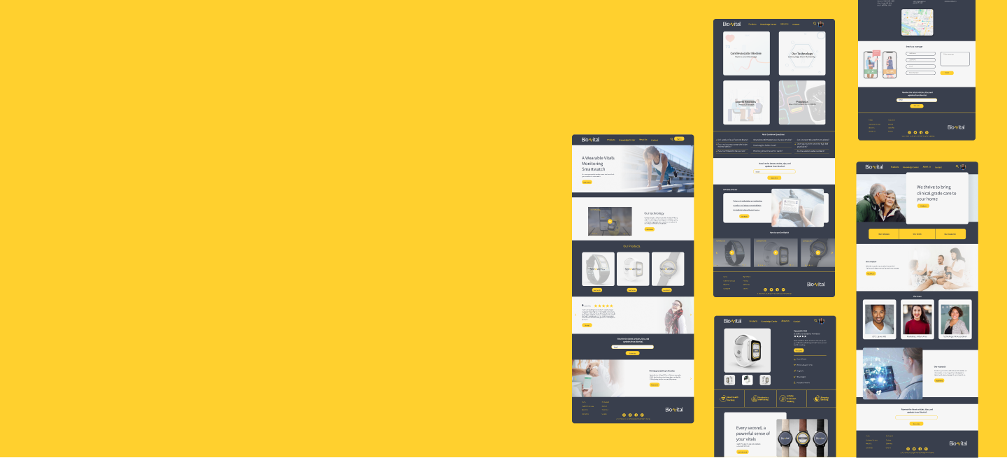
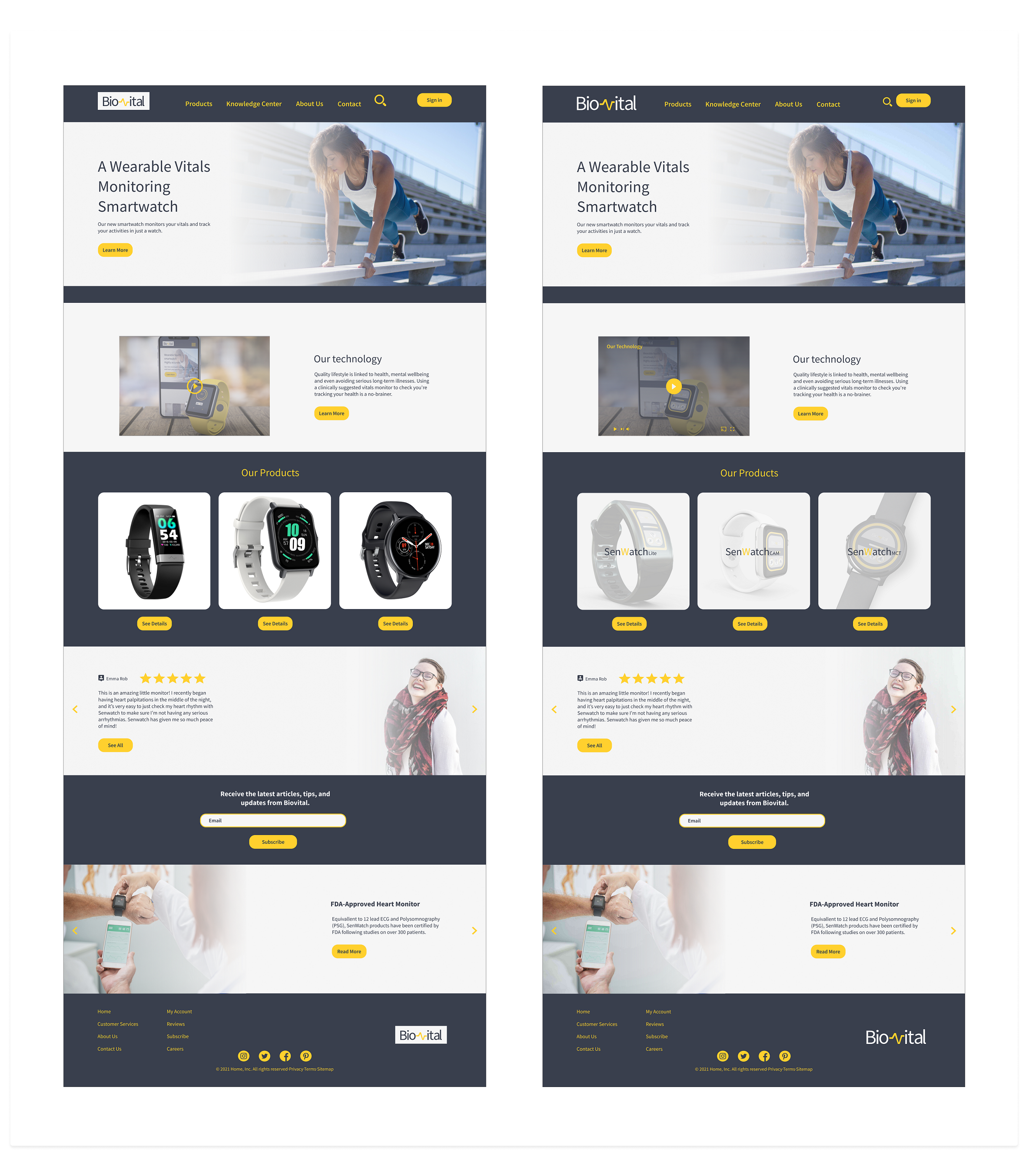
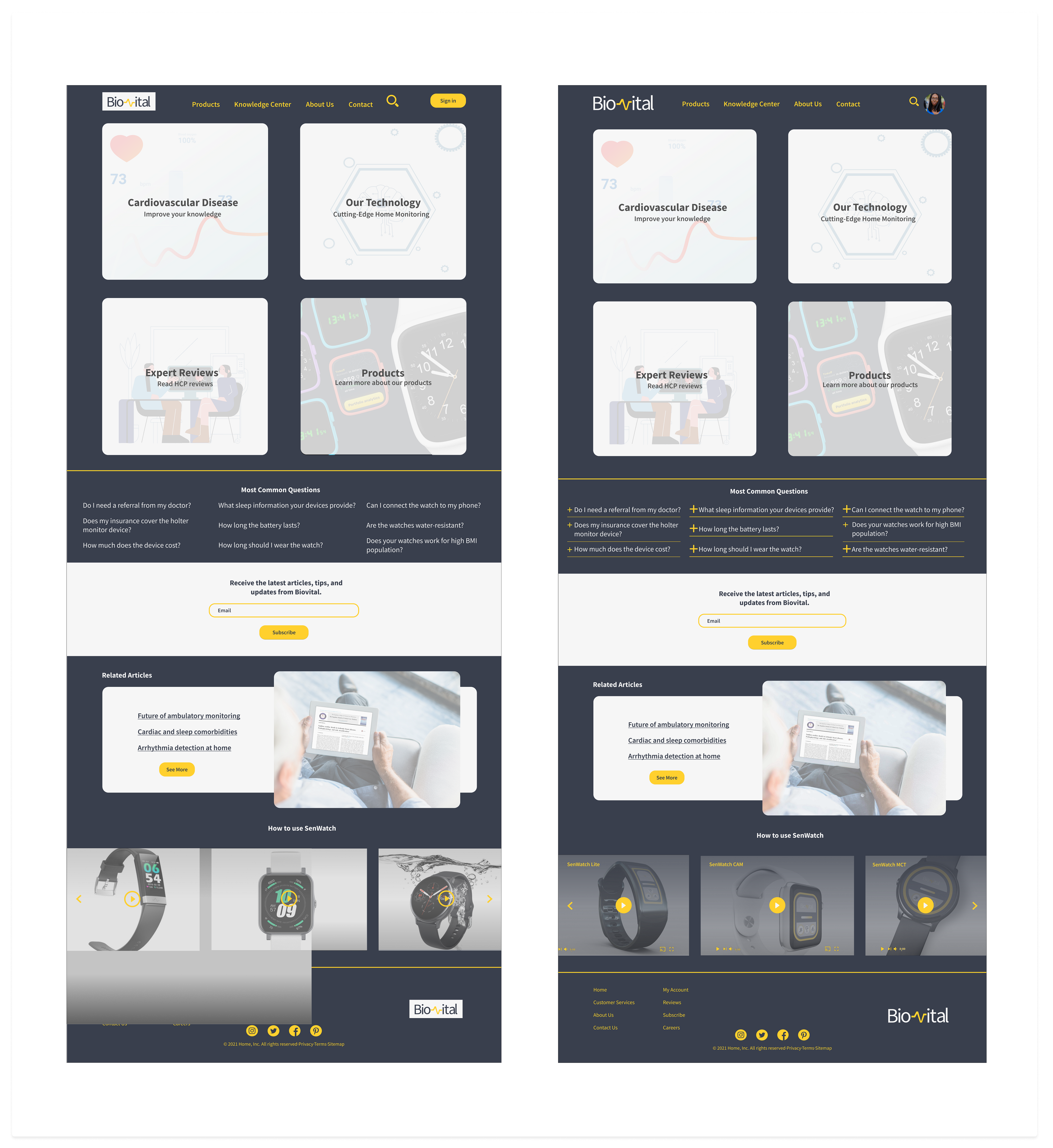
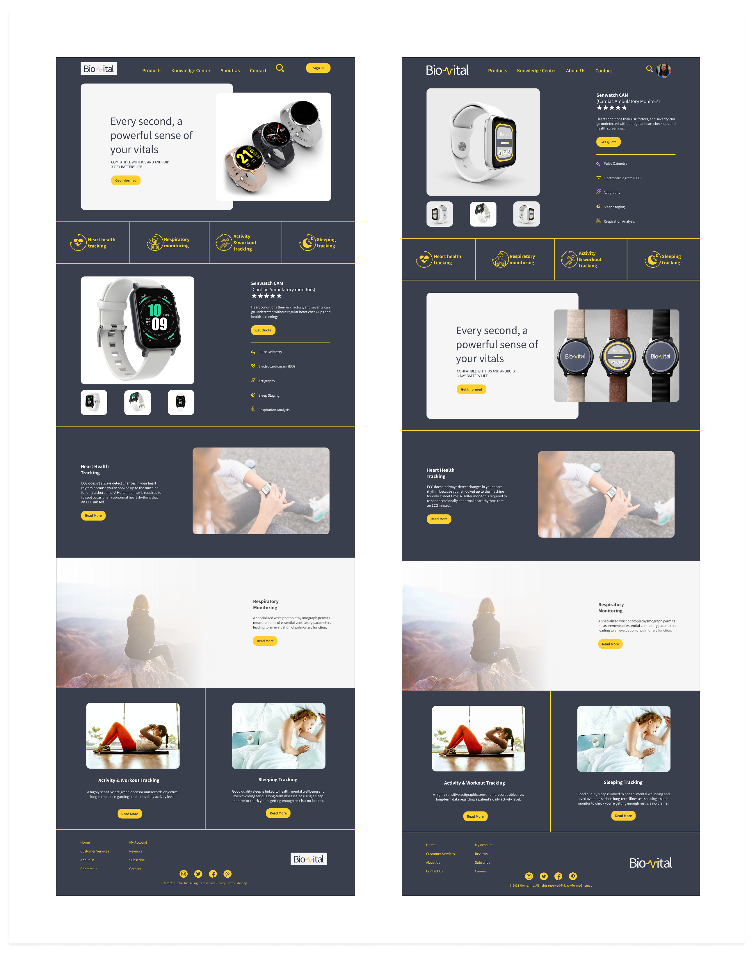
Hi Fidelity Designs v1

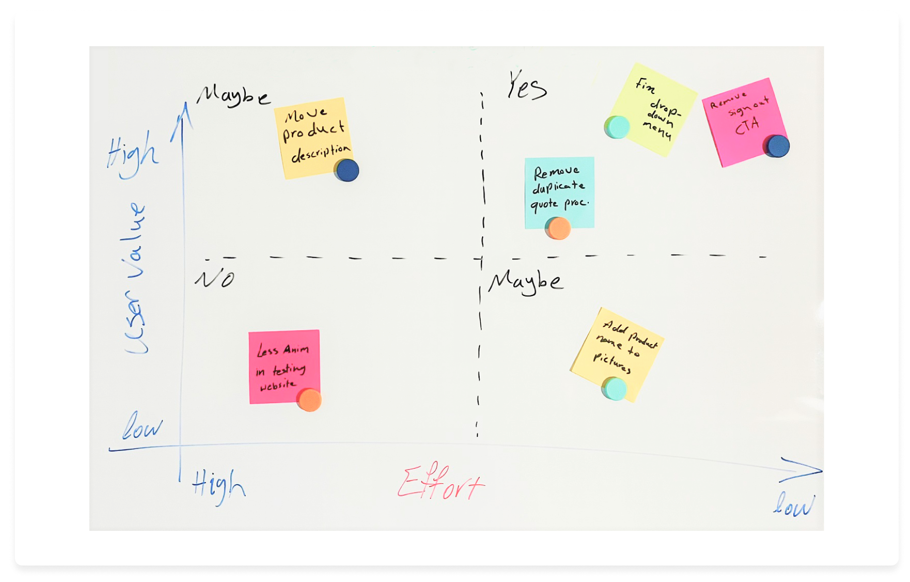
Usability testing and iteration on the design was a vital part of the design process. The decision matrix I created out of testing helped me improve the design to a large extent and to target iterations that were more important to the users while relevant to the business requirements.

It is always challenging to create a completely brand new website, exciting though! Working in start-up environment with limited inputs from the client, requires an extremely well-structured strategy and a well-established communications.
In this project:
anahita.azari@gmail.com
